While in my Logo design class I was tasked with making a symbol logo for an electrical car charging station company. When beginning the project, I had to come up with a name for the company, that being Synergy. The definition of synergy is the interaction or cooperation of two or more organizations, substances, or other agents to produce a combined effect greater than the sum of their separate effects. I believed this name was perfect because of the idea that people are using electric cars in order to better the environment.
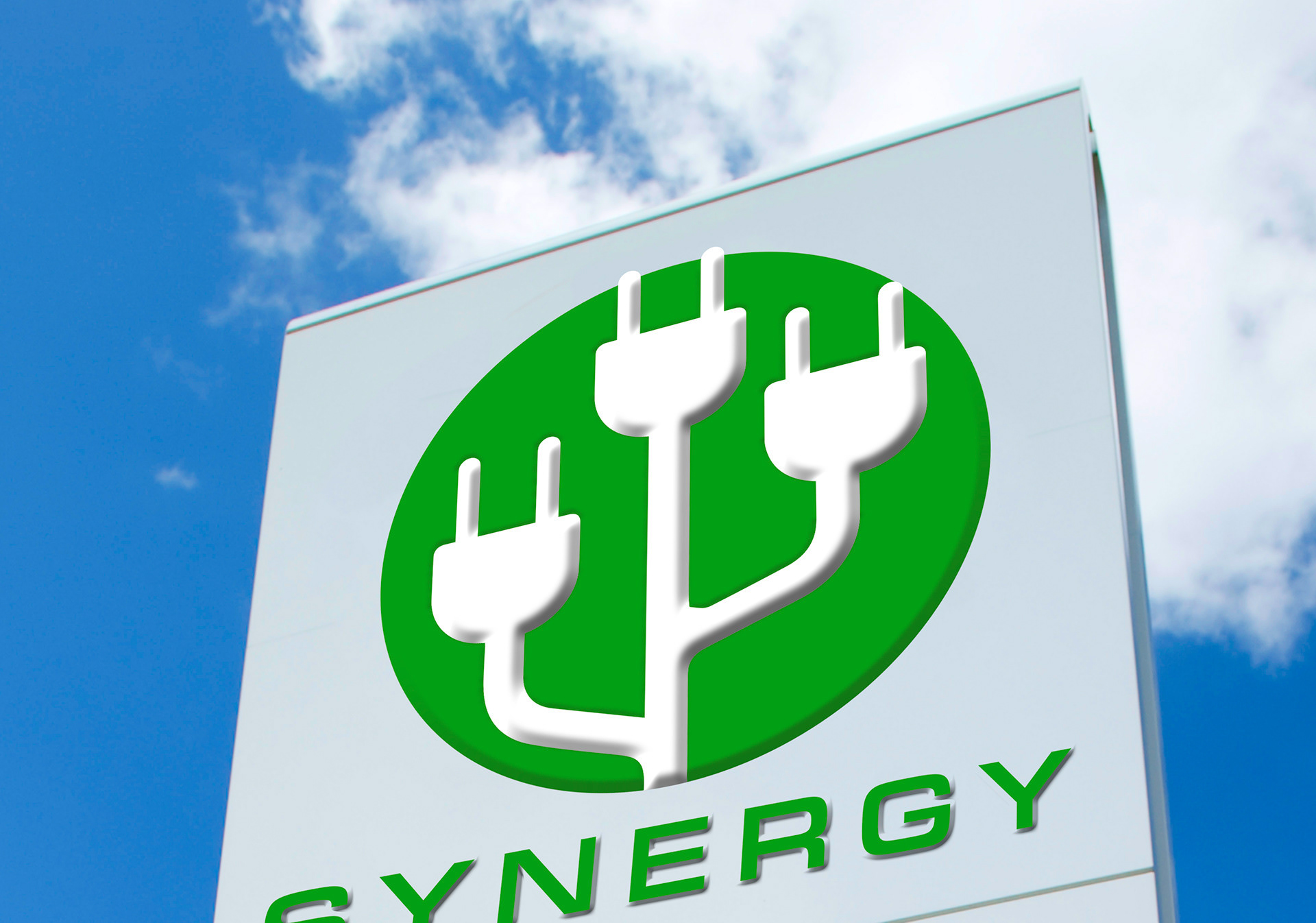
When it came to the actual logo design I had gone through various designs and concepts. I also used various color palettes, mainly switching from yellows to greens, as I felt those colors best help represent the idea of a sustainable energy. In the end I went with a round shaped symbol with a more dynamic shape throughout the center. The dynamic shape is made up of wires and plugs to create a silhouette of a tree. This was meant to represent the sustainment of the environment.
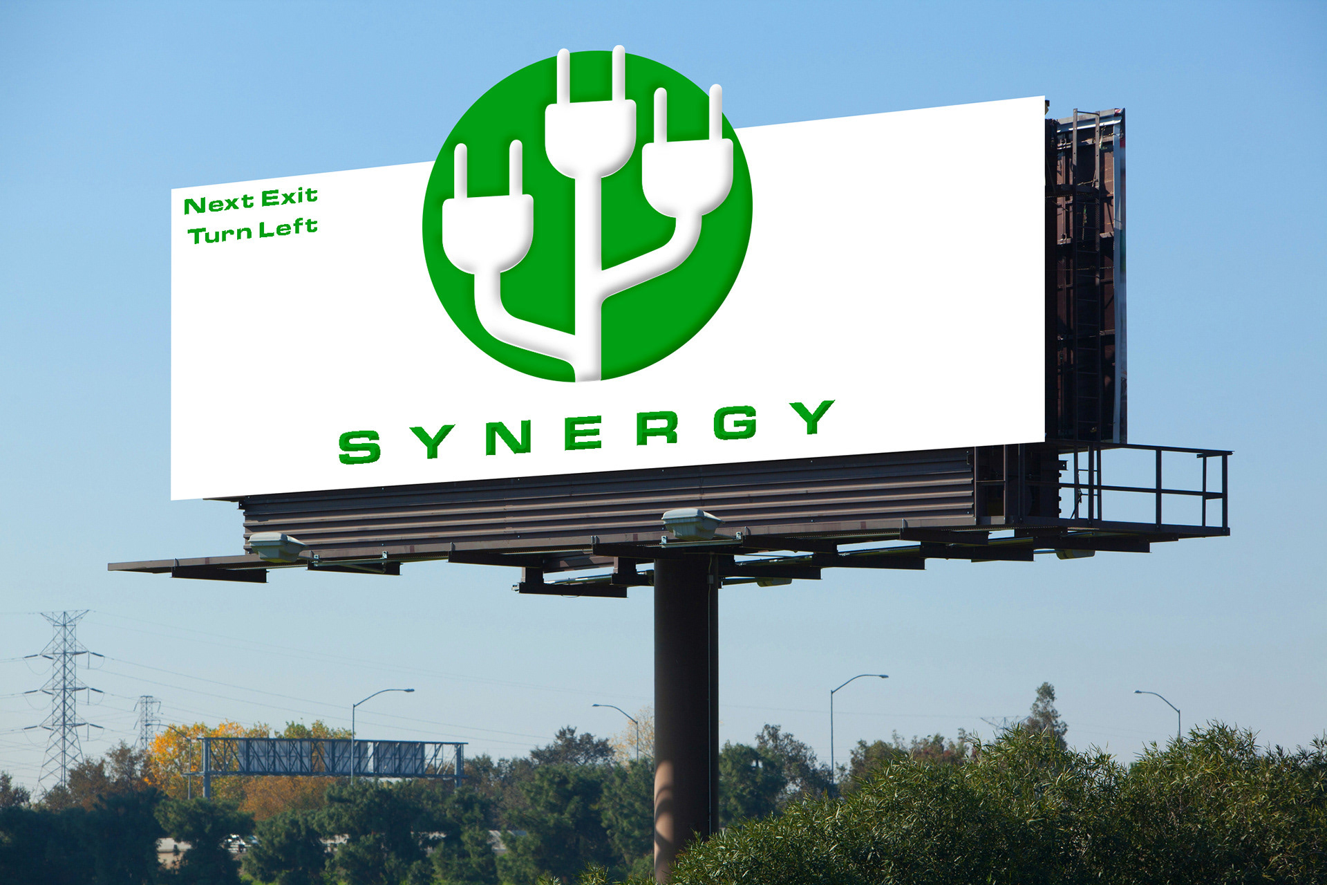
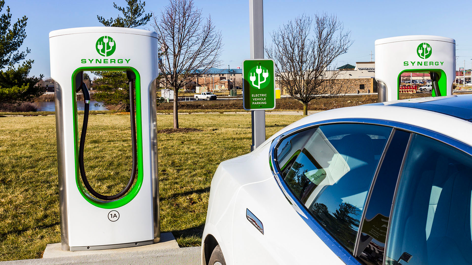
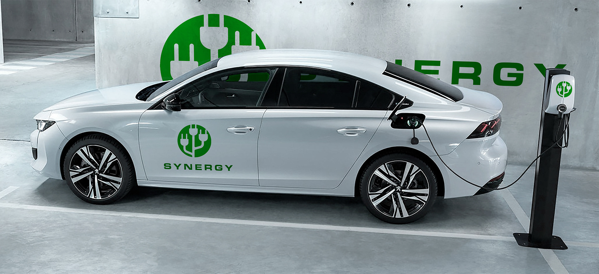
The final portion of this project was to apply our logos to various environments and objects. This was to show what it would really look like if applied to charging stations.
